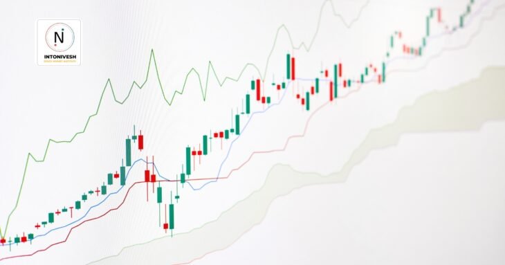
When traders begin their journey in the stock market or forex market, one of the first challenges they face is reading price charts. Two of the most common types are bar charts and candlestick charts. Both show how prices move over time, but they present information differently.
If you’ve ever wondered “Which is better – bar chart or candlestick chart?”, this guide will help you understand the key differences in a simple way.
What Is a Bar Chart in Trading?
A bar chart is one of the oldest chart types used in technical analysis. Each “bar” represents price movement for a set time period (such as 1 minute, 1 hour, or 1 day).
- The top of the bar shows the highest price during that time.
- The bottom of the bar shows the lowest price.
- A small line on the left shows the opening price.
- A small line on the right shows the closing price.
In short: A bar chart gives you four main pieces of information – Open, High, Low, Close (OHLC).
What Is a Candlestick Chart?
A candlestick chart was first developed in Japan hundreds of years ago to track rice trading. Today, it is one of the most popular tools for traders worldwide.
Each “candlestick” also shows Open, High, Low, Close prices, just like a bar chart. But the difference is in how the data is displayed:
- The thick part of the candlestick is called the body.
- If the closing price is higher than the opening price, the candle is often shown in green (bullish).
- If the closing price is lower than the opening price, the candle is usually red (bearish).
- Thin lines above and below the body are called wicks or shadows, showing the high and low.
In short: A candlestick chart tells the same story as a bar chart, but in a more visual and colorful way.

Bar Chart vs Candlestick Chart: Key Differences
Here’s a simple comparison between the two:
| Feature | Bar Chart | Candlestick Chart |
|---|---|---|
| Data Shown | OHLC (Open, High, Low, Close) | OHLC (Open, High, Low, Close) |
| Appearance | Thin vertical lines with small ticks | Thick candle body with wicks |
| Easy to Read? | Harder for beginners | Easier and more visual |
| Shows Market Sentiment | Less clear | Very clear (bullish/bearish candles) |
| Popular Among | Old-school traders, professionals | Most traders worldwide |
Main takeaway: Both charts show the same information, but candlesticks make it easier to see whether buyers or sellers are in control.
Why Traders Prefer Candlestick Charts
Most traders today use candlestick charts because:
- Easy visualization – Green and red colors quickly show uptrends and downtrends.
- Pattern recognition – Candlestick patterns (like Doji, Hammer, Engulfing) help predict possible price reversals.
- Market psychology – You can easily see the fight between buyers and sellers.
For example, a long green candle shows strong buying pressure, while a long red candle shows strong selling pressure.
When to Use Bar Charts Instead
Even though candlestick charts are more popular, bar charts still have some advantages:
- Cleaner look – For traders who want fewer distractions, bar charts can be less cluttered.
- Professional use – Some institutional traders prefer bars because they are more “neutral” and don’t rely on colors.
- Quick focus on price levels – Bars can make it easier to compare exact highs and lows.
Which Is Better: Bar Chart or Candlestick Chart?
The answer depends on your trading style:
- If you are a beginner, candlestick charts are better because they are simple, colorful, and help you quickly understand the market.
- If you are an experienced trader who prefers raw data without too many patterns, bar charts may work for you.
However, for most traders today, candlestick charts are the preferred choice.
How to Choose the Right Chart for Trading
When deciding between bar chart vs candlestick chart, ask yourself:
- Do I want to clearly see market psychology? → Go with candlesticks.
- Do I prefer a clean, minimal chart? → Use bar charts.
- Do I need to learn price patterns? → Start with candlestick charts.
Example: Same Data, Different View
Imagine a stock opened at ₹100, went up to ₹110, dropped to ₹95, and closed at ₹105.
- On a bar chart, you’d see a vertical line from 95 to 110, with small ticks for open (100) and close (105).
- On a candlestick chart, you’d see a green candle with a body from 100 to 105, and wicks extending from 95 to 110.
Both show the same data, but candlesticks make it faster to read at a glance.
FAQs About Bar Chart vs Candlestick Chart
Q1. Are candlestick charts better than bar charts?
Yes, candlesticks are generally better for beginners because they are easier to read and show market psychology clearly.
Q2. Do professional traders still use bar charts?
Yes, some professionals use bar charts because they prefer a simpler view without color-based bias.
Q3. Can I use both charts together?
Absolutely. Many traders switch between candlestick and bar charts depending on what they want to analyze.
Final Words
Both bar charts and candlestick charts are useful tools in technical analysis. They show the same price information but in different formats.
- Bar charts are simple, neutral, and favored by some professional traders.
- Candlestick charts are colorful, easy to read, and preferred by most traders today.
👉 If you are just starting your trading journey, go with candlestick charts. They will help you understand the market faster and give you confidence in reading price movements.
In the end, the “best chart” is the one that makes you comfortable and helps you make better trading decisions.
Read Also: